Technical analysis of visual equity, brand performance, and digital craft.
When launching a new project, the temptation to cut corners is immense. Freelance platforms offer hundreds of options like "logo for $20." However, in practice, such short-term savings turn into massive, hidden financial losses within the very first year. A logo is not just a picture — it is the absolute foundation of your brand.
For a symbolic price, designers rarely create a product from scratch. Most often, they use stock templates or, worse, copy existing works. For UK or European businesses, this is a direct path to legal disputes. If your logo violates someone else's intellectual property (IP), you will have to completely rebrand, destroy printed assets, and face heavy fines.
Modern consumers are deeply spoiled by premium visuals. A cheap, sloppy design is subconsciously read as a sign of a fly-by-night company. If a business is not ready to invest in its own face, is it ready to deliver a quality product? You will burn your ad budget, but conversion will stay low because your assets do not command trust.
A professional logo is engineered as a highly responsive system. It must look absolutely flawless on a tiny app icon, an Instagram avatar, and a massive billboard. Cheap logos break during scaling, turning into an unreadable blur, or are delivered in formats that are technically impossible to use for professional print.
Conclusion: Investing in professional design is an asset, not an expense. A high-end logo protects your reputation for years, increases the perceived value of your product, and legally allows you to sell your services at a higher tier than your competitors.
Many entrepreneurs believe that having a single logo is completely enough to start a business. But when it comes to launching the first Facebook ad campaign, styling a LinkedIn corporate profile, or building an investor pitch deck, chaos inevitably begins. Social media visuals clash, typography is inconsistent, and the brand looks blurred. The solution is a comprehensive Brand Identity system and a strict Guidebook.
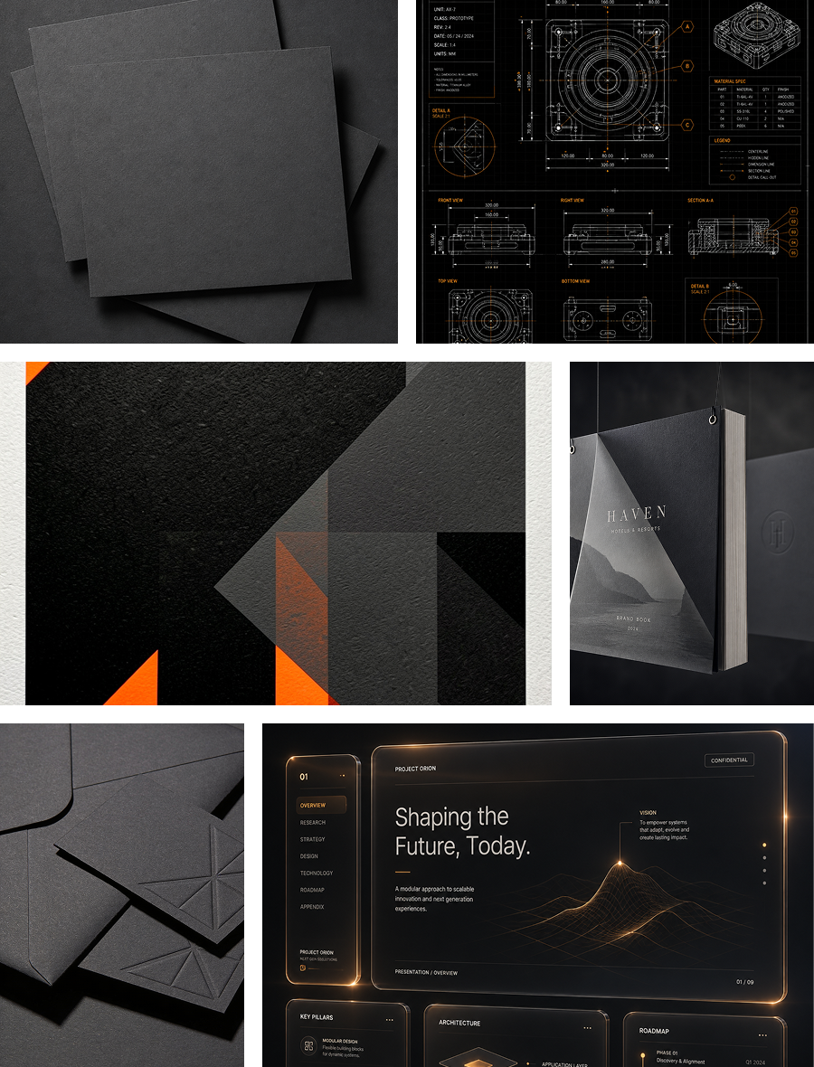
Brand identity serves as the comprehensive visual language of your enterprise, encompassing a strictly defined color palette with precise codes for digital and CMYK print, alongside corporate typography grids, custom patterns, functional icon styles, and structural layout templates for marketing banners.
To manage this ecosystem, a technical Guidebook acts as the ultimate manual for your brand; when onboarding a new marketer, ad specialist, or content manager, there is zero need to spend hours explaining post designs—you simply hand over the documentation. This completely eliminates human error, ensuring your brand remains cohesive, sharp, and perfectly uniform across all global platforms.
Furthermore, with a ready-made design system in place, the velocity of producing new marketing creatives accelerates by 3 to 4 times, as designers no longer need to reinvent the wheel when operating within strict layout grids and rules. Consequently, you pay significantly less for specialist billable hours and launch critical marketing tests much faster. Ultimately, a strong brand thrives on relentless consistency, and a robust identity system coupled with a technical guidebook guarantees that in the eyes of your client, your company always appears as a solid, stable, and highly trustworthy business.